O2E Brands
Franchise Pages
I led the redesign of O2E Brands’ Franchise Development pages for WOW 1 DAY PAINTING, You Move Me, and Shack Shine. Collaborating with multiple teams, my responsibilities included competitor analysis, research, interviews, stakeholder meeting presentations, testing, and design. The goal was to enhance conversion and attract higher-quality candidates.

Design Problem
O2E Brands offers exceptional home services and franchise ownership opportunities. However, the franchise pages lacked a user-friendly, cohesive experience. I aimed to:
Reflect O2E's culture: Make the pages feel as welcoming and supportive as O2E's community.
Update content: Align with new brand standards and incorporate fresh, inclusive imagery and accessibility features.
Increase conversion: Improve usability to encourage prospective franchise partners to contact the Franchise Development team.
Improve candidate quality: Ensure the pages were clear, inviting, and reflective of O2E’s values.
Challenges
Timeline: Limited resources across brands.
Multiple stakeholders: Differing priorities, including A/B testing versus rapid launch.
Implementation complexity: Each brand had unique needs, developers, and platforms.

Process
We held weekly review meetings with diverse stakeholders across Web Development, Franchise Development, Creative, Content, Analytics, SEO, and Leadership. Early design feedback was gathered through sketches and wireframes, iterated upon with regular feedback, and validated via user testing.
Competitor Research: I analyzed franchising websites, especially those ranked on Entrepreneur’s Franchise 500 list. Feedback from stakeholders was incorporated into the wireframes and organized via Jira and Trello.
User Testing: Prototypes were tested with Franchise Partners and marketing team members. Key insights included:
Users preferred shorter text, especially on mobile.
Financial information needed prominence.
CTAs were often lost in long text.

Outcome
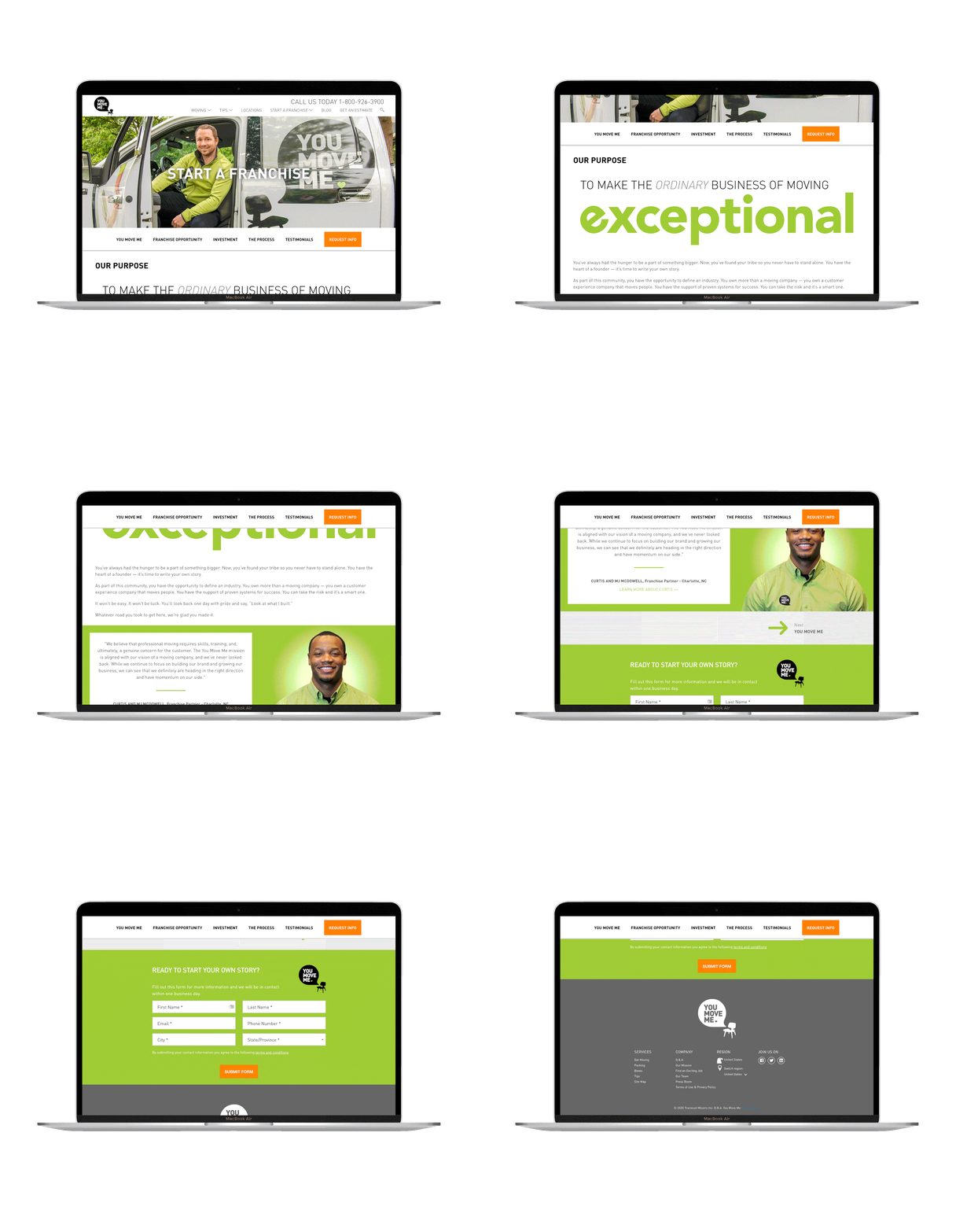
I unified the franchise pages with a consistent design while preserving each brand’s individuality. Key updates included:
Simplified content: Reduced text, with clear subsections and engaging graphics.
Prominent financial information: Created an “Investment” section for easy access and made the information more prominent on the homepage.
Improved CTAs: Orange buttons were added for better visibility, including a sticky navigation bar for consistency.
Mobile optimization: Designed intuitive, familiar navigation and a clearer CTA on mobile.
Inclusivity: Used real Franchise Partner testimonials and more diverse imagery.
The updated sites were cohesive, user-friendly, and aligned with O2E Brands' culture. Our analytics team saw a notable increase in site conversions within weeks, and the Franchise Development team achieved their business goals, with improved candidate quality. Despite areas for improvement, I'm proud of this project. It allowed me to evolve through user-centered design, applying my skills and collaborating with my team to create impactful websites.