
Reimagining MunchaLunch
MunchaLunch is an online platform that allows parents and caregivers to pre-order school lunches for their children. It streamlines meal ordering, fundraising, payment processing, allergy tracking, and volunteer coordination, easing administrative tasks for schools and providing convenience for families. I reimagined the site as part of my Designing for Accessibility course, with accessibility considerations integrated from start to finish.

User Research & Feedback
Purpose: Improve MunchaLunch so that it is more accessible
Participant Demographics: Parents & Caregivers of Elementary School Aged Children (38-75) reached by email or in person
Feedback:
word choices are confusing & redundant
a lot of colours, could be more toned down to help navigate
hard to open PDFs on iPhone
lots of pop-ups on phone
awkward user experience


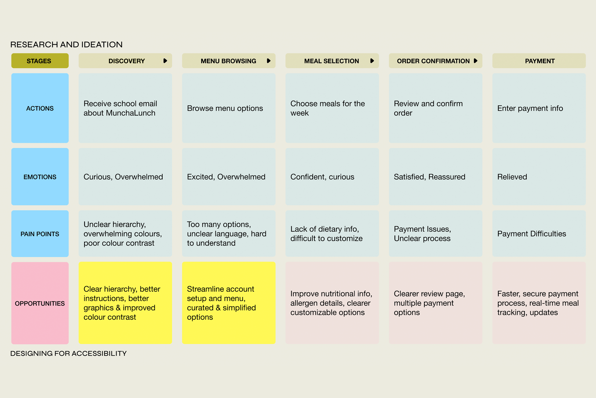
Journey Map
A journey map for parents or caregivers ordering hot lunches for children through MunchaLunch that outlines the actions, emotions & pain points that they experience throughout the process to help identify opportunities for improvement.


Low-Fi Wireframes
Landing Page
Current:
Hierarchy is confusing: redundant & repetitive titles/sections
Text is very small
Background is distracting, so many colours, hard to see
Updated:
Divided sections into ORDERS and ACCOUNT
More users are familiar with this hierarchy
Bigger text
Plain background

Low-Fi Wireframes
Edit My Order
Current:
You cannot edit dates individually
You have to remove all the upcoming dates and edit every single one
You then have to resubmit all of the upcoming orders
Updated:
You can edit by date in Upcoming Orders

Low-Fi Wireframes
Order History
Current:
When you click VIEW a pop-up appears and you automatically download a PDF
Confusing, especially on mobile
Only lists 4 orders in chronological order
Updated:
Order History shoes items ordered in app rather than on a PDF
Lists all orders beginning with the most recent


User Testing Results
Way easier to navigate
Aesthetically better, more calm
However needed more to test to get a better sense of user experience
In the future, I would narrow the design scope further. There was so much I wanted to accomplish, and I thought this would be a simpler project than it turned out to be. It was a good lesson in time management; I had anticipated spending more time designing and prototyping but ended up getting very involved in the design research side. In my effort to make the design accessible, I removed a lot—including potentially some character and brand identity. Going forward, I would aim to find a better balance between designing for accessibility and creating an engaging, fun user experience.